Thursday, September 25, 2008

Photo Style


I have been browsing flickr while I have been in class... It really depresses me. I feel like at this age I should be so much better at photography than I am. I am still searching for my style, and I still feel like a stupid photo student who is just doing sub par work. My stuff is getting better, but it has yet to go past the level of amateur student. I need to find my voice, and stop comparing myself to others. Everytime I look at others work, I just feel discouraged, especially some of my peers work. Not so much in my classes, but Melissa and Kassia, they are so talented and don't really have any formal training. I need to start seeing better... I just don't know how...

Work In Progress


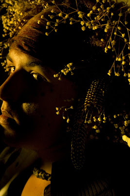
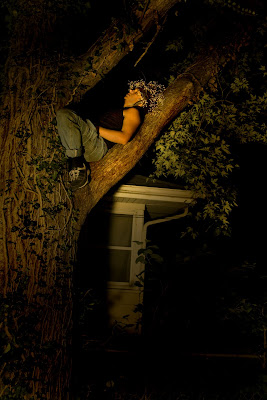
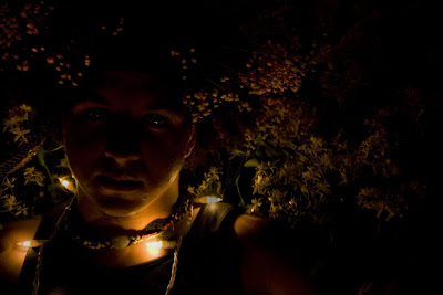
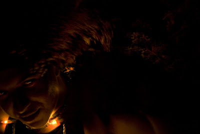
These are my tentative final shots for my interpretive portraits.

Richard Avedon


Irving Penn


Tuesday, September 23, 2008


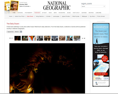
I GOT IN TO THE NATION GEOGRAPHIC DAILY DOZEN!!!!!!! ONE OF THE ACTUAL PHOTO EDITORS AT NATGEO LOOKED AT MY WORK AND OUT OF ALL THE PHOTOS THTA SHE SAW YESTERDAY MINE WAS IN THE TOP 12!!!!1
LINK

heres a screen shot of it on the home page!

Tuesday, September 16, 2008

Printing Notes

.Calibrate in this lab, not print lab
.Test Print: small strips same size and resolution

File Size Copying
. duplicate: Apple F4
.keep last four digits of your copy the same as the original print name to make it easier to find
.Resolution should stay the same

.8 chain the width and height together so they increase or decrease in proportion
.Dicubic to smooth when colors


Printing
.clean nozzles before you print
.Epson Printer Utility--> Nozzle Check
.do not use auto and no power clean heads!
.use regular white printer paper to clean heads
.gamma 2.2, native white point to test printing

When Printing your Images
.copy on to desktop to allow printing to go faster
.double check printing orientation
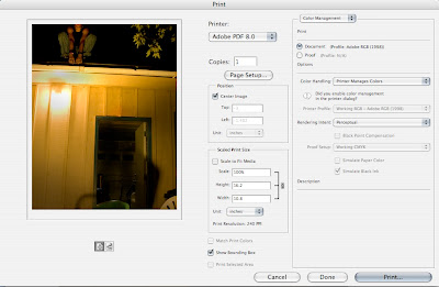


.Let printer manage color
.Render Intent: Perceptual
. X black point compensation
.Check the printer is correct
. 1 copy
.X center image
.X Show bounding box (if not seen, size or orientation is not correct)


Page Setup
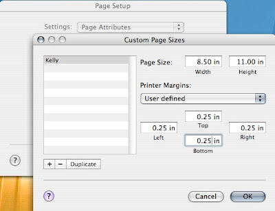


.Manage Custom Sizes---> click + than title your custom size.
. Make sure all printer margins are the same
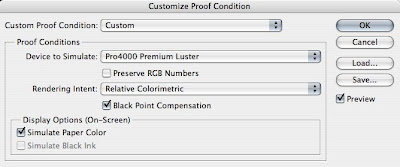


Click out of Printer Menu

Go to VIEW at the top of the screen
View---> proof set up---> custom---> select paper (400 premium luster)
.X simulate paper color, gives you an idea what your print will look like

Print Settings:
.advanced: 720dpi


Tips!
.do not save as JPeG
.save as tiff no compression
.for web sending Apple F4 to make copy, set resolution at 72 and go back to 8 bit color
.if the print has too much of one color in it, dial up the opposite color to counteract that.

Printing Tips
.print emulsion side down


HW: 1 print for Thursday, write out all the printings steps that you did.
Paper

My first image I is blurred representation. It suppose to feel fantasy like and mysterious. He is a representation of the inner spirit, a Puck almost. I want to show the physical representation of the inner voice and spirit. I do this by not making my subject in focus, and showing him in motion, giving a feeling of not being real.
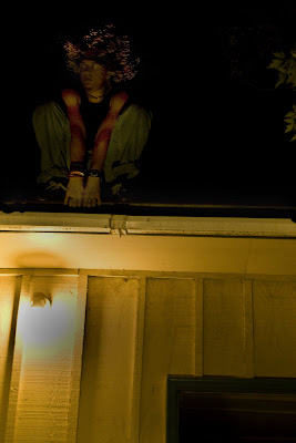
In this photograph, I wanted to show him in a modern setting being more concrete, but still looking like he is out of place in this setting. Here he peers over the house as if a gargoyle looking down. He is a fantasy character, but now in a realistic setting. The scenery is eery, to emphasize his sort of wild nature and make him seem more mysterious.
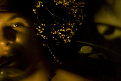
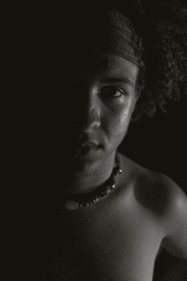
This is another close, but much more intense. He look on guard and wary, showing that intensity in his eyes. The flora in his hair stand up like porcupine spikes and he seems on the defensive. The dark lighting does not let the eye see everything on purpose to leave interpretation to the imagination. The lighting also allows the photograph more intensity to enhance his expression.
This photograph is more relaxed, but still showing this character in a fantastical way. He is sleeping on the branch in front of a house. He is in a real setting but he still seems a combination of unnatural and concrete. The spot light is on him, as if he has been caught by an onlooker, but not awakened.
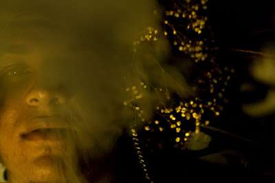
The last photo displays his in a smokey haze. This is the most unclear out of all the photos. It is intentionally so, and it boosts the level mystery. This photo is a close up so his emotion and face feel very real but the setting feels very unrealistic. I picture him or her as a wild child, sort of Puck like, from a Midsummer Nights Dream, mischievous and not refined as a contrast to our very refined actual appearance and actions.

Monday, September 15, 2008

Lee


There was a girl who was taking photos of a mannican in a window and I couldn't remember Lee Friedlander's name at the time, but I wanted to show her these photos,and how he used the reflection of the store windows to his advantage, instead trying to work around it.

Thoughts on Project


So, I just downloaded my six G's of photos from this weekend. I think I am getting so much better just from the fact that I have to be constantly photographing things. I am still struggling with my concept for my interpretive portrait. I know I want to show a physical representation of the inner voice. If that makes sense... Its the more emotional primitive inner voice that is in all of us. I sort of picture him or her as a wild child, sort of Puck like, from a Midsummer Nights Dream, mischievous and not refined as a contrast to our very refined actual appearance and actions. I just need a way to display that, because every time I talk to Pok about it he thinks I am trying to do a primitive man vs. modern man approach, which I guess is an aspect I should think about, but not really what I am trying to portray. Anyway... I am still very befuddled and its due tomorrow, so what I do have will just have to work.
These are some of the photos I have been working on. The more I look at them the more I realize how cartoony and costumy... I need work, but hey I learned something.

Thursday, September 11, 2008

Notes

The article depends on the photo not the other way around.
What is the message? How do you illustrate that?

Talk to the subject, become personable. 15 questions to get to know them, and find out about them. Make the photograph enticing. Talk to engage them, be interesting, humorous, to lighten the mood.

be prepared for rejection, and above all else have courage.

versatility
know your equipment well

it takes more than a great portfolio to get the job.

channel work, to use in multi directions

be in control!!!!

how am I going to use the elements to help me?

Shoot often, shoot a lot

move around to make things work
move sets, move lighting, vantage point for effectiveness

no need to punch people in the face however

give and take

HW: 5 edited photos dues for tues. 1. stay with people 2. illustrative


Ideas for photoshoot

. projector, putting images of city scapes on his face
. working on the computer
. standing on the computer
. standing on a car
. driving

Story


I'm trying to capture something more primitive about my person. In general he is swayed by his emotions and not about thinking things through, instinct rather than thought. I'm trying to capture that unique combination between the primitive spirit that controls his emotions and to an extent his reactions, but also maybe showing tht he is still a man that lives in a modern world and is controlled by modern standards.

Tuesday, September 9, 2008

Notes


bracketing is good
watch for focus
watch for body shakes
prepare shot before subject matter gets there, so that the kinks are worked out before hand.

The beauty of color the beauty of light
make the viewer discover
visual poetic
who are the famous people in art?
beauty in death
know the music, know the person
sestative for peoples' reaction and make it yours
create vs. reaction
treat your frame like a piece of canvas
draw what you want to say
more accurate with what you have and what you want to say.
know what to subtract what does it take to make it work?
chaos of reality
cannot subtract move to a different canvas

Calibrating Monitors

Apple---> system preferences---> expert mode

move sliders until the apple disapears

6 steps, middle tones, dark tone, highlights, ect.
1.8 mac monitors, mac gamma

2.2 pc monitor

last used native point, keep

HW: work on being more deliberate with your portraits. Write about photograph, how are you being deliberate, how are you using the elements of design? What is beauty?

Tuesday, September 2, 2008

Clarity and Photography

Aperture
3.5 4.0 4.5 5.0 5.6 6.3 7.1 8.0 9.0 10 11 13 14 16 18 20 22 25 29

As the aperture number gets bigger the hole gets smaller, letting less light in and more depth to the photo. The larger the whole less depth.

Critical Focus: what is sharp.

Recognizable Focus: Not necessarily in focus, but portraying information still.

Shutter Speed


4000, 3200, 2500, 1000, 500
4' 8' 15' 30' Bulb

Less Depth= More light-------------->more depth=less light

Color Temp./ Visible Light Spectrum

.measured in Kelvins
.Kelvins relate to the visible light spectrum
.Light is our medium, RGB
R[2000] -------------------B[7000]
Do not point Camera at the sun it will burn the censor

Heat can register on film, but not on the visible light spectrum (must use infared Film)


Raw Files


Visible Light Spectrum

now measured in nano meters
invisible light 10,000-10,000,000


What is Logical Thinking?
How does one use the visible light spectrum


Color Temp Profiles
.camera model
.computer monitor
.paper
.enviroment in which the image is being viewed

Intention Vs. Result

Coniousness of the angle
the line of the elements of design to frame of the camera
vantage point
alignment


Use: Temp, Tint, Clarity

Do Not Use: Vibrance, Saturation


HW: photograph texture thinking about acute angles. ISO Study, only change iso use timer and table for stablizations, new folder on computer about the elements of design

Color Temperature and Visible Light Spectrum

http://en.wikipedia.org/wiki/Light_spectrum

Monday, September 1, 2008

Elements of Photography

Depth of Field


[work in progress]

Blind Pear Study

When I first start to feel the pear in the dark the first thing I realize is how cool to the touch is it. Even though it has been sitting out for days, it still holds a temperature that is far colder than the surround air. Everywhere it emits a coolness from it's inner core. I start to further investigate my pear, and I notice how leather it's skin is. It has slight ridges or tiny bumps that melt together to form a slight rough exterior. The skin is surprisingly strong as well, even though is it paper thin. My nail even has a hard time piercing it. The pears roundness starts to come in to my frame of mind. I hold it firmly in my palm and feel the weight of it. Then I start to investigate its grooves and angles. I realize that while in my palm the pear felt very solid and round, when I run my fingers across it the roundness of the object becomes almost an illusion. There are bruises and bumps, mountains and valleys hidden underneath it's surface. The pear doesn't appear round at all now, but more amorphous. Then I move my fingers towards the pear's protrusions. There is a long slender stick coming off of it, which brittle leaves are attached to. They crinkle when I graze them and flake off if I apply too much force. The stem itself feels warm in comparison to the fruit and goes from slender at the base of the pear too much fatter and bumpier the further away. The leaves are rough with rougher edges and feel delicate in death. They don't have a disguising shape, but they are flat as paper and have tendency to curve favorably in one direction. Once again I move back to the fruit itself. They body of the pear underneath the skin feels rotten and squishy, as if it were rotting. The skin however smells sweet, like honey. The leave smell woodsy, but hard to distinguish their smell from the strong honey like smell of the fruit.